New release! Attractive ways to improve customer engagement
In our recent releases we’ve been working on the back end to improve targeting and translation. Today we’re making it easier for you to create engaging interactive walkthroughs. This release includes new ways to attract users to guide them through your onboarding flows. There are also improvements under the hood for smoother integration.
If you’re planning your customer engagement strategy, these are important features to consider.
Improve customer engagement with launchers
Now you can change the style of Tooltips and Launchers to draw user’s attention without getting in their way. These attractive launchers can link to pop-over tooltips, or right into a user onboarding flow, or step-by-step tutorial.
Say for example, you’re making a new product launch, or announcing a new feature. As part of your customer engagement strategy, you may want to reach out to existing users so they don’t miss this new feature or product upgrade. Because these users have already been through your product onboarding process, they’re already familiar with your application. If they’re quite adept, they may not notice subtle changes in the UI. Tooltips can be helpful, but even still, they may tend to think those are for new users. Instead, try changing the look with a Hotspot which pulses. This will draw the user’s attention so they don’t miss important information.
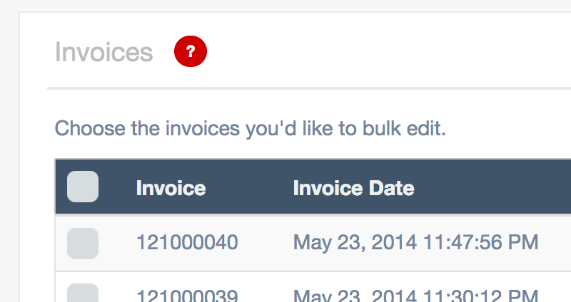
Previously, by default a tooltip or a launcher was a question mark in a circle. Here are the new styles of Launchers and Tooltips, and how you can use them with different content.
Tooltip
When to use a Tooltip. New users especially like information points like these in the UI. A small question mark shows where you provide more information. You can replace the content with single characters such as a small “i” for information. This can save users from having to refer to an FAQ outside your app or seek support.
Hotspot
When to use a Hotspot. Create a hotspot to draw attention to a new opportunity in your application. Need to highlight a new upgrade to existing users? This will help draw their attention.
Text
When to use the Text style launcher. In some cases, you may want to prompt users with a short phrase. With this style, you can change the text to a single word or two and the launcher has a fixed width.
Long text
When to use the Long text style launcher. This is similar to the Text style launcher, except this will resize to fit more text. For example, Long text could be useful when users are filling out a form, you might like
Smoother user flows and interactive walkthroughs
With Inline Manual you can target any selector in your application such as a header, or a table or a button. You may want to draw a user’s attention to a table header, or prompt them to click on a link. Our Authoring tool identifies the best selector in most cases without requiring you to code or know the source code of your application.
If you were just making a product tour, the selectors you interact with in your app wouldn’t matter too much. Generic headers and tables might do really well in most cases. However, if your customer engagement strategy depends on guiding your new users through your application, and prompting them to click specific things in your UI, then being precise about the selectors you choose is very important.
What makes Inline Manual stand out is the way you can use interactive prompts to get users to take action within your application. With interactive walkthroughs, you can also react to user events in your application, for example when they click or hover over elements in the user interface. Making this work relies on the selectors you identify when you’re building your walkthroughs. The more specific you can be with the selectors, the more precise you can be with how you prompt users and respond to interactions.
This release improves how the Authoring Tool detects elements in your user interface. Now you can find better selectors and fine-tune your walkthroughs for specific applications.
You won’t see any changes visible in the authoring tool, all the magic is happening under the hood. The default behaviours should work nicely with both single page applications and dynamic elements. Our Customer success managers will be able to help with the initial configuration if the defaults won’t work as expected, so please do contact our Support team.
Find out how to fine-tune the CSS selectors in the Authoring tool.
Conclusion
When you’re implementing your user onboarding and customer engagement strategy, you don’t want to be limited in what you can do. Thanks to our customers for continuing to share your stories and experience with us so we can better understand how you use Inline Manual.
We’re always looking for ways to make it easier to get fine-grained integration with your application so your users have a seamless experience. This release will make it easier to be precise when creating interactive experiences, with smoother integration with your app’s user interface. And you can provide help for users to keep them engaged and in your application.
We’ve also released various bug fixes and ongoing stability improvements, which help us to continue to deliver you 99.97% uptime.
Subscribe to our newsletter
The latest news, articles, and resources, sent to your inbox weekly.