Add knowledge base articles to in-app help
Summer has been very busy for us and we are bringing a lot of new updates to our service including the possibility to add a new topic type Redirect. It will allow you to link to any external resource. Link to knowledge base articles, support centre or files. Unify the user experience.
Link to external content from within the widget
Create a Topic type Redirect, which will look just like the other Topics in the widget. Except once the user clicks on it, it will open a new window with a new address specified by you - e.g. a knowledge base article.
Two new Segments for autolauncher
Before the official release of the full segmentation we have added two new Segments.
Everyone but new user - the autolauncher will launch for users that were created (signed up) in more than 24 hours and haven’t seen the Topic.
All users - the autolauncher will launch for all users who haven’t seen the Topic.
You can also re-order the autolaunchers - this will affect how they are being launched (from top to bottom).
Authoring tool
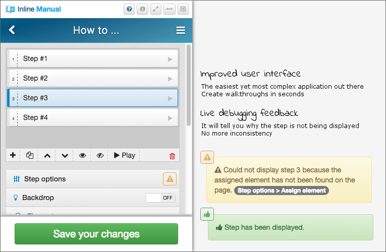
The authoring tool has seen quite a lot of new updates, including the user interface, we are aiming to make it the easiest and fastest tool out there - based on your feedback, we are almost there!

Live debugging - no more inconsistency
Ever wondered why the step is not appearing during the content authoring? We have added live debugging tool which will tell you exactly why a step is not appearing. p This will make your life so much easier and authoring faster.

Multiple elements
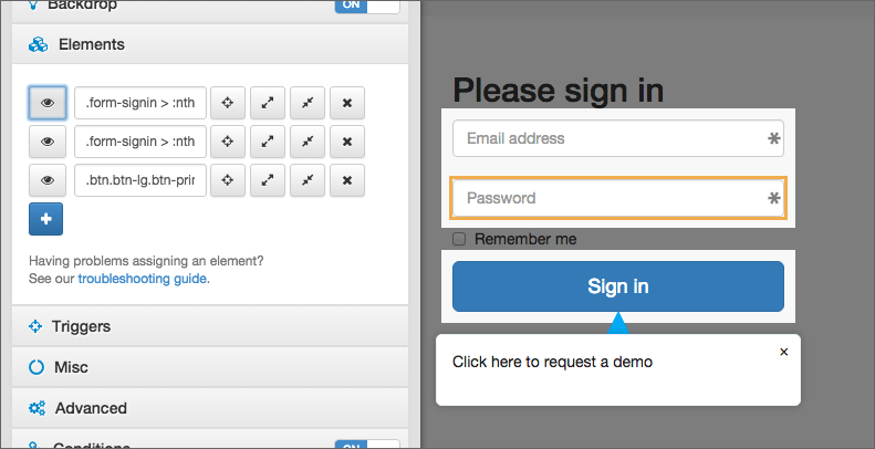
Target multiple elements right within the Authoring tool. This allows you to highlight multiple elements or just make the step point at them. Traversing and previewing selected elements With the addition of multiple elements handling, you can also use three new features. We believe these will help you fine tune the elements as you wish and target elements that were not possible to target before.
Preview: which will highlight selected element so you can easily find it
Expand selection: which will go through the HTML structure one level up
Contract selection: which will go through the HTML structure one level down
Tooltips
Show tooltip content on mouse over
We added activate and de-activate triggers to the tooltip launcher. You can now select from mouse enter and mouse leave, this will make the content of the tooltip appear on hover and disappear when the user moves away from the tooltip. The click trigger is still the default option.
Add Next and/or Previous buttons to tooltip
You can allow the user to move back and forth through the tooltips, just like walkthrough. We will be extending this further in the future, based on your feedback.
Templates are available to tooltips too
We rolled out step templates some time ago for walkthroughs, they are now available for tooltips too.
Other features good to know about
Hide trigger only for mobile devices
For mobiles you might not want to display the Inline Manual player, you can enable this in your Site > Settings > Player settings.
Remove Inline Manual branding
Don’t want to show “Powered by Inline Manual”? You can disable it through Site > Settings > Player settings.
New trigger events
We have added on blur trigger, which allows you to move to the next step when a user leaves an input field. But we also added triggers that will work with the Drag&Drop functionality.
We hope you like this update, we will be back really soon with more.
As always, get in touch if you will need any help setting this up.
Subscribe to our newsletter
The latest news, articles, and resources, sent to your inbox weekly.