User onboarding for SaaS: a practical guide
User onboarding is the process of helping new users understand your product, take the right first steps, and reach value quickly.
For SaaS companies, good onboarding does more than welcome new signups. It helps users complete setup, learn key workflows, adopt useful features, and keep making progress over time. As a result, teams often see better activation, stronger product adoption, fewer support requests, and higher retention.
Bad onboarding does the opposite. It overwhelms users, asks too much too early, and delays the moment when they finally see value.
In this guide, you’ll learn what onboarding is, why it matters, which patterns work best, and what practical steps you can take to improve it today.
Table of contents
Frequently asked questions about onboarding
- What is user onboarding in SaaS?
- When should user onboarding start?
- Who owns user onboarding?
- Why does onboarding matter?
- What is the goal of onboarding?
- What makes user onboarding effective?
- What are common onboarding patterns?
- How do you improve user onboarding?
- How long should user onboarding last?
- What is the difference between documentation and onboarding?
What is user onboarding?
User onboarding is the experience that helps users go from sign-up to success.
In SaaS, that often includes:
- the first login experience
- setup and configuration
- in-app guidance
- onboarding emails
- help content and documentation
- follow-up communication as the product evolves
The goal is simple: help users reach their first meaningful outcome as quickly as possible.
That outcome will differ by product. In one app, it might be creating a project. In another, it might be inviting teammates, importing data, publishing content, or completing a first transaction. Whatever the action is, your onboarding should guide users toward it.
Onboarding is often treated as a customer success activity. However, it is also a product, UX, and communication problem. It sits between product, marketing, support, and training.
Why onboarding matters
Onboarding matters because users do not buy software to admire the interface. They buy it to make progress.
Strong user onboarding reduces early drop-off and helps more people reach value.
A new user usually arrives with limited time, limited patience, and a specific goal. If your product helps them move toward that goal quickly, they keep going. If it confuses them, they leave.
That is why it has such a strong effect on:
- activation
- trial-to-paid conversion
- feature adoption
- support volume
- retention
Most users do not need a tour of every feature. They need help taking the next useful step.
Good onboarding makes that next step clear.
Who is this guide for?
This guide is useful if you are responsible for:
- marketing a SaaS product and improving trial conversion
- customer success or support and helping users get value faster
- product or UX and improving activation and adoption
- internal training during a software rollout
Your context may be different, but the core problem is the same: new users need help getting from interest to value.
Great onboarding is not about showing off the product. It is about helping users get value from it.
Video: what is user onboarding?
In this video, we look at the big picture of onboarding and the practical steps you can take right now.
Why onboarding is never finished
Many teams think onboarding ends after account creation.
However, it does not.
Users go through onboarding at different points in the customer lifecycle:
- when they first sign up
- when they start using the product after purchase
- when a teammate invites them
- when they return after a long break
- when you launch a major redesign
- when you introduce a new feature
- when an internal process changes
At the same time, your product is changing too. You learn from users. Your market evolves. New competitors appear. Early adopters and later-stage buyers often need different things.
That means onboarding is not one flow. Instead, it is an ongoing system that helps users succeed as their needs change and your product evolves.
Why onboarding fails
Most onboarding fails for a few predictable reasons.
It tries to explain everything at once
Teams often pack too much into the first-run experience. They want users to understand every feature immediately. The result is information overload.
It treats all users the same
Different users have different goals. An admin, a manager, and an end user may need completely different guidance. Generic onboarding feels less relevant and less useful.
It adds friction before value
Long forms, empty screens, too many setup decisions, and mandatory configuration can block progress. Users abandon the product before they experience a useful outcome.
It happens outside the product
Documentation, videos, and support resources all help. But when users must leave the product to understand what to do next, many of them drop off.
The best onboarding is relevant, timely, and in context.
Documentation versus onboarding
Documentation and onboarding are both important, but they solve different problems.
Documentation is there to be comprehensive. It helps users look up details, explore features, and solve specific problems.
User onboarding is there to guide action. It helps users take the next step and build momentum.
A simple way to think about it:
- documentation is the map
- onboarding is the guide
Users rarely want to read everything before they begin. They want a clear path to success. That is why in-app guidance works so well. It gives users help when they need it, in the place where they need it.
This does not mean in-app onboarding replaces documentation. It means each channel has a role:
- documentation supports deeper learning
- in-app onboarding supports progress in context
- support helps with blockers and exceptions
- emails bring users back and reinforce progress
The strongest onboarding strategies combine these channels.
Common onboarding channels
Most SaaS onboarding programs use several channels together. In practice, strong onboarding uses more than one channel. Each one has strengths and trade-offs.
Product UX
Good product design is the base layer of onboarding. Clear navigation, sensible defaults, empty states, and progressive disclosure reduce the amount of explanation users need.
Best for: making the product easier to understand by default
Limitation: product changes can take more time to ship
In-app messages and walkthroughs
These include tooltips, checklists, modals, and interactive walkthroughs. They help users move forward without leaving the product.
Best for: contextual guidance and faster time to value
Limitation: poor targeting turns helpful guidance into noise
Email onboarding
Email helps before and after the first session. It works well for reminders, nudges, re-engagement, and follow-up education.
Best for: lifecycle communication over time
Limitation: open rates and click-through rates are often low
Documentation and help content
Articles, videos, and reference materials support users who need more detail or want to learn at their own pace.
Best for: self-serve support and deeper learning
Limitation: often out of context
Human support and training
Live chat, calls, and screen sharing can work very well for complex products or high-value accounts.
Best for: complex onboarding and high-touch support
Limitation: hard to scale
Two principles for better onboarding
If you only improve two things, start here.
These two principles will improve onboarding in almost any SaaS product.
1. Match the message to the right user
Not every user cares about the same outcome.
A product may serve different roles, industries, levels of experience, or use cases. If your onboarding treats everyone the same, much of it will feel irrelevant.
Segment users based on what matters:
- role
- plan
- lifecycle stage
- behavior
- use case
- account status
Then tailor the onboarding to each segment.
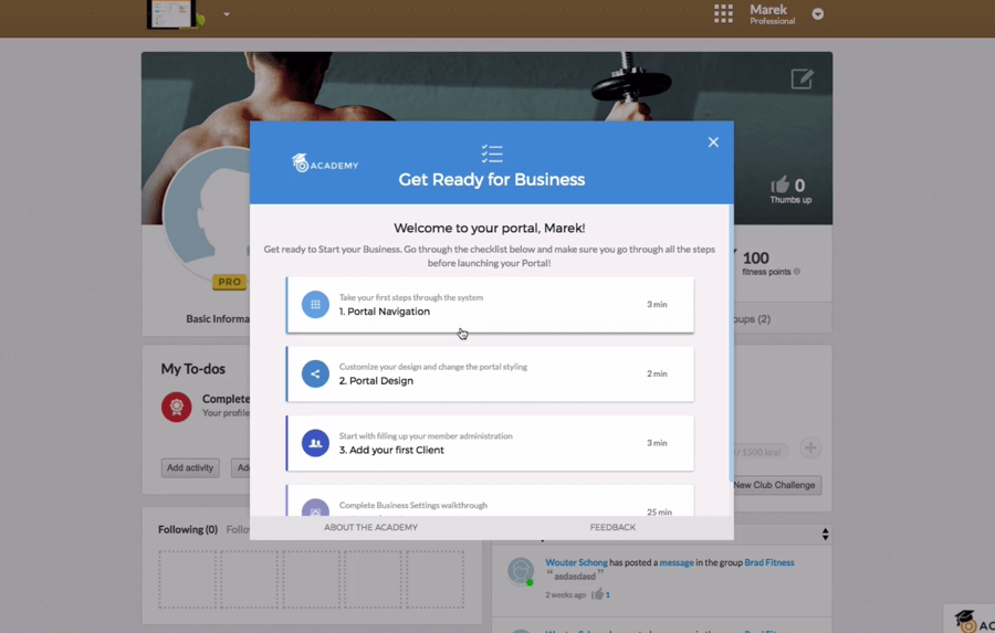
For example, one of our customers, Virtuagym, uses different onboarding experiences for different user roles. Business users see one set of tasks and guidance. End users see another. That makes onboarding feel more relevant and helps each group move faster.

The more specific your onboarding is, the more useful it feels. In other words, relevance beats volume.
2. Reduce friction and get users to value faster
Free-trial users have limited commitment and limited time. They are still deciding whether your product is worth learning.
That means your onboarding should remove barriers, not add them.
Look for places where users get stuck:
- long forms
- too many setup decisions
- lack of sample data
- unclear next steps
- empty states with no direction
A practical way to reduce friction is to use sensible defaults, templates, or sample data.
For example, some products let users explore with sample content before they complete full setup. That gives people a chance to understand the product before they invest more effort.
Our customer eToro does something similar. Instead of asking users to risk real money in the learning phase, they provide play money so users can practice while they learn their investing model.
So, the lesson is simple: reduce effort before value.
Common onboarding patterns
Most user onboarding flows rely on a few familiar patterns. Each one has a different job.
| Pattern | Best for | Tip |
|---|---|---|
| Interactive walkthroughs | guiding users through a key workflow, setup, or first task | Keep them short and focused on one outcome |
| Tooltips and hotspots | highlighting features, clarifying UI, and suggesting next steps | Use them sparingly to avoid clutter |
| Modals and welcome screens | announcements, welcome messages, important updates, or key choices | Keep the copy concise and action-oriented |
| Checklists | helping users complete a short sequence of important tasks | Make progress visible |
| Contextual help widgets | giving users access to relevant articles, tours, and support | Show content based on where the user is in the app |
The best onboarding patterns do not try to explain the whole product. They support the task the user is trying to complete right now.
Common onboarding use cases
Here are a few common onboarding goals and the tactics that work well for each one.
Do you want users to upgrade or convert?
Use onboarding to show the value of paid features in context.
Tactics:
- show a tooltip when users reach a feature that supports their goal
- highlight upgrade-worthy features at the right moment
- trigger a checklist for trial users with a few high-value actions
- use concise modals to explain what users unlock by upgrading
Do not push too early. Show the upgrade path when users are close to understanding the benefit.
Do you want to improve feature adoption?
New features often go unnoticed, especially by existing users with established habits.
Tactics:
- segment users based on role or behavior
- show targeted launch messages after release
- offer a short walkthrough when the feature becomes relevant
- keep help available in the widget for later reference
Feature adoption improves when the message is timely, relevant, and easy to revisit. Likewise, the best prompts remain easy to find later.
Do you want to reduce support requests?
Many support tickets come from repeatable questions and moments of confusion.
Tactics:
- provide contextual articles and walkthroughs inside the app
- show help based on where the user is
- link support content directly from tickets or messages
- improve empty states and common dead ends
Good onboarding does not just teach users. It also prevents avoidable confusion.
Do you want to support structured training?
Sometimes users need more than a quick prompt. They need help learning a full process.
Tactics:
- create walkthroughs for common workflows
- use checklists for multi-step tasks
- add in-app articles for infrequent or complex actions
- launch messages when a new internal process is introduced
This is especially useful for employee onboarding and internal software adoption.
Onboarding best practices
No matter what product you build, these practices apply.
Good user onboarding usually comes from getting these basics right first.
Focus on one outcome at a time
Do not try to teach the whole product in one flow. Pick the next meaningful step and support that.
Design for different user segments
Onboarding should reflect who the user is, what they need, and what they are trying to achieve.
Reduce setup friction
Use defaults, templates, and sample data where possible. Avoid asking for information before it becomes necessary.
Keep onboarding inside the product
Users are more likely to act when guidance appears in context.
Make progress visible
Checklists, task lists, and completion states create momentum.
Re-engage users after the first session
Use email or in-app messages to bring users back to unfinished tasks or newly relevant features.
Treat onboarding as an ongoing system
Users need help after signup too. New features, product changes, and returning users all create onboarding moments.
How to measure onboarding success
You cannot improve onboarding if you do not measure it.
That is especially true if you want to improve user onboarding over time.
Start with a few simple metrics:
Activation rate
How many new users complete the key actions that lead to value?
Time to value
How long does it take users to reach their first meaningful outcome?
Onboarding completion rate
How many users finish the onboarding flow, checklist, or setup sequence?
Feature adoption
Are users discovering and using the features that matter most?
Retention
Do users come back after the first session, first week, or first month?
Support volume
Are support tickets going down as onboarding improves?
The best set of metrics depends on your product. Still, the principle stays the same: measure where users stall, where they drop off, and what helps them move forward.
Onboarding checklist
Use this checklist to review your current onboarding.
- Is the value of the product clear in the first session?
- Do users know what to do next at every step?
- Are you guiding users toward a meaningful outcome?
- Have you removed unnecessary setup friction?
- Do different user types see different onboarding?
- Is help available inside the product?
- Are you measuring where users drop off?
- Do you support onboarding after signup, not just at signup?
- Can users revisit help later without starting over?
- Are you improving onboarding based on behavior and feedback?
If you answered “no” to several of these, you already know where to start.
User onboarding across the customer journey
Effective user onboarding does not happen in one moment. Instead, it works best when it supports people from sign-up to long-term adoption.
First-time user onboarding
First, user onboarding should help new signups complete the next useful step. For example, it can highlight setup tasks, explain key actions, and remove obvious friction.
Trial user onboarding
Next, user onboarding should help trial users reach value before time runs out. In addition, it should show which actions matter most during the trial period.
New customer onboarding
After purchase, user onboarding should reinforce confidence. However, it should not stop at a welcome screen. Instead, it should guide teams through setup, adoption, and early wins.
Feature-release onboarding
Meanwhile, user onboarding should also support existing customers when new features launch. For example, it can introduce a new workflow with a short message, checklist, or walkthrough.
Returning user onboarding
Sometimes people come back after a break. In that case, user onboarding should help them reorient quickly. Similarly, it can highlight what changed and what to do next.
Long-term user onboarding
Finally, user onboarding should support ongoing learning. Strong onboarding keeps helping users discover value, adopt new features, and stay confident as the product evolves.
Conclusion
Onboarding is not just a product tour. It is the system that helps users succeed with your product.
For SaaS teams, that means more than welcoming new signups. It means reducing friction, guiding users to value, supporting different user types, and helping customers keep up as the product evolves.
The best onboarding is clear, contextual, and practical. It does not try to say everything. It helps users do the next important thing.
Start small. Pick one high-friction moment, improve it, and measure the impact. Even small changes can lead to better activation, stronger adoption, fewer support requests, and higher retention.
How Inline Manual helps with user onboarding
Inline Manual helps SaaS teams create in-app onboarding experiences without heavy development work.
You can use Inline Manual to:
- build interactive walkthroughs
- show tooltips and announcements in context
- create onboarding checklists
- target onboarding by segment
- connect users with relevant help content inside the app
That makes it easier to guide users at the right moment and improve onboarding over time.
Next step
Ready to improve onboarding?
If this guide gave you ideas, take the next step and launch a better onboarding experience.
Onboarding resources
If you want more inspiration, these resources are a good place to start.
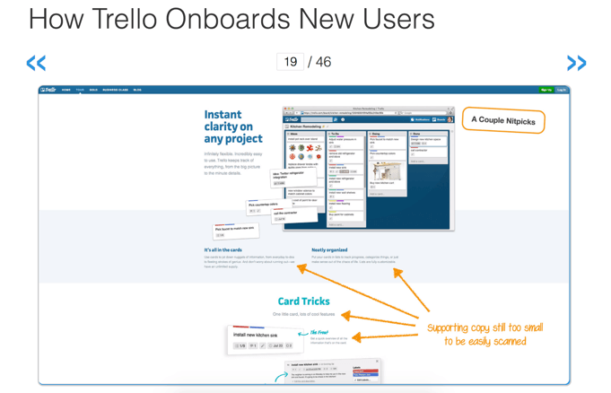
Check out our post on inspiring examples of user onboarding.
Teardowns on UserOnboard.com
These teardowns focus on sign-up flows and the time it takes users to reach their wow moment. They are useful for studying copy, flow, and interaction design.

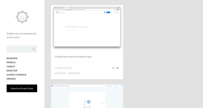
Empty States
If you want to reduce friction during onboarding, study good empty states. A useful empty state gives users a reason to take the next step.

Other onboarding pattern libraries
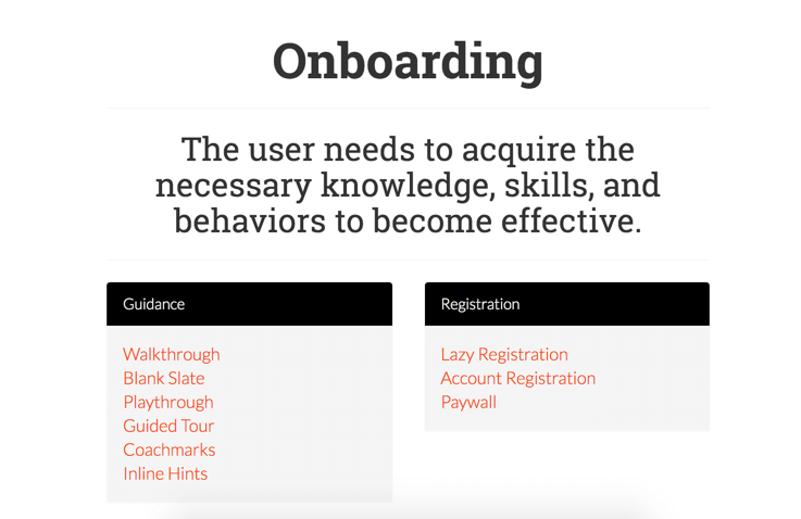
Visit Patterns for new user experiences for critiques and examples of common onboarding patterns.
You can also review UI Patterns: Onboarding for more onboarding ideas and use cases.

Frequently asked questions about onboarding
What is user onboarding in SaaS?
User onboarding in SaaS is the process of helping users understand a product, complete setup, and reach value quickly. It includes the first login experience, in-app guidance, emails, help content, and follow-up communication.
When should user onboarding start?
User onboarding should start as soon as a person signs up or enters the product for the first time. Ideally, it begins before confusion appears, not after.
Who owns user onboarding?
Usually, user onboarding is shared across product, customer success, support, and marketing. However, the best version has one clear owner who keeps the experience consistent.
Why does onboarding matter?
Onboarding matters because it affects activation, conversion, adoption, support volume, and retention. When users get value quickly, they are more likely to keep using the product.
What is the goal of onboarding?
The goal of onboarding is to help users reach their first meaningful outcome as quickly and smoothly as possible.
What makes user onboarding effective?
Effective user onboarding is clear, relevant, and timely. In other words, it works when it helps users take the next useful step without adding noise.
What are common onboarding patterns?
Common onboarding patterns include interactive walkthroughs, tooltips, hotspots, modals, welcome screens, checklists, and contextual help widgets.
How do you improve user onboarding?
You improve user onboarding by reducing friction, segmenting users, guiding them in context, focusing on one outcome at a time, and measuring where users drop off.
How long should user onboarding last?
User onboarding should last as long as users still need guidance. For some products, it may focus on the first session. For others, it may continue through setup, adoption, and feature discovery.
What is the difference between documentation and onboarding?
Documentation is designed to be comprehensive and searchable. Onboarding is designed to guide users through the next useful step in the product.
Editor’s note: This post was originally published on July 12, 2017 and updated on March 24, 2026 for comprehensiveness.
Subscribe to our newsletter
The latest news, articles, and resources, sent to your inbox weekly.